2020 is over!! I’ll write a proper 2020 roundup and 2021 plans post later, but first I need to close out the pressing business of the last 2 weeks.
No writing!!
It is has been a super slug-like 2 weeks off, and I have loved every minute of it. I actually watched little TV or movies, rather I spent my time playing Civilization 6 – a game I thought for years was empty and unfun. Now I am seeing some greater depth and competitiveness. Going for a culture victory is way more fun than either science or domnation.
But I won’t go on about that.
I have the new cover for Wren book 2! I continued with my same artist I found through 99 designs, who did the gorgeous cover for book 1 – https://www.michaeljohngrist.com/2020/12/wren-1-cover-evolution-2020-writing-week-51/
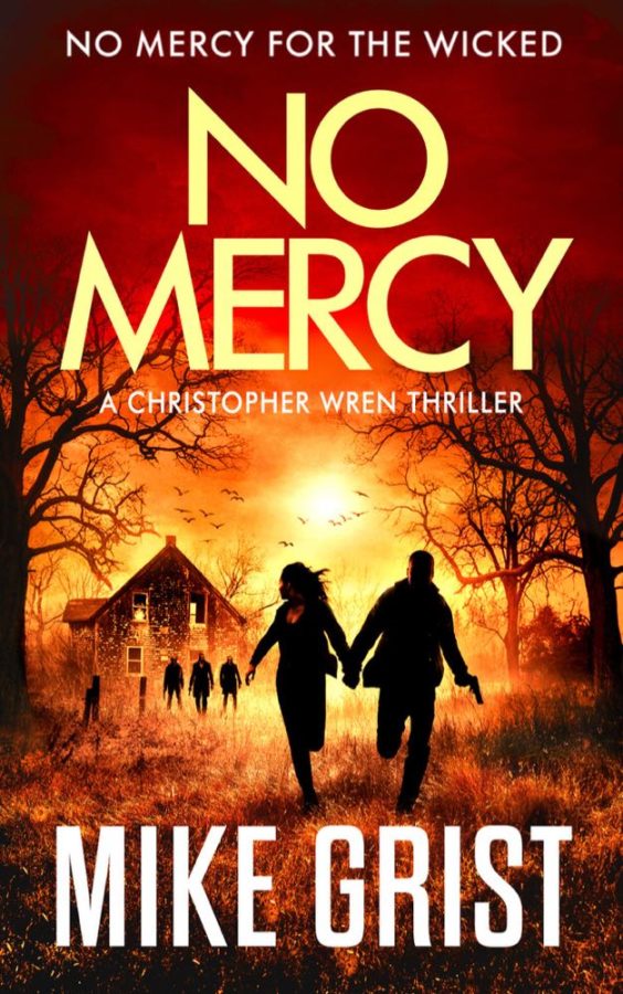
I had 2 concepts. One was a guy sky-diving, but this one proved pretty hard to make dynamic. Weird but true. Second concept was a farmhouse raid. Here it is:

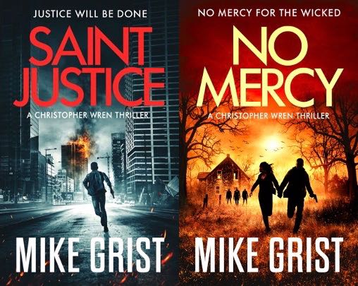
I think it is fantastic and well in keeping with the first book. Here they are together:

Pretty gorgeous, right? Let’s take a look at the path to get here:

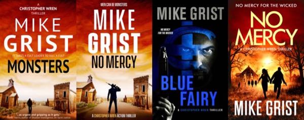
What a voyage. You can really see the movement from more amateur to expert. The left 2 covers were self-made. Far left was aping Jack Reacher covers – it looks quite a lot like his covers, a tiny guy hitch-hiking into some empty one-horse town.
It doesn’t represent the tone of the book at all. It only represents the opening scene. The book is a dark terrorism thriller, not a vigilante justice, so it shouldn’t look like Jack Reacher.
I began to figure that out gradually- the second cover increased the size of the guy, added a gun, went for more thrillery fonts. I think it’s better, but it’s still an empty, abandoned town, and the guy is facing nothing. It’s bright and kind of cheerful, when the tone of the book is far from that.
Cover 3 is just a copy of the one cover I had made for Saint Justice by Damonza. I had no idea how to make a second cover in that style, so just switched up the colors. It was on looking at all those books in a row (5 in the series all looking identical) that I realized I needed a new design.
The new one has the same color scheme – that wasn’t really planned, it’s just where the artist went to. I toyed with having the title as Blue Fairy in blue, but it looked weird. I’ll show you in a second. I actually tinkered with this cover for days, trying to figure out why it didn’t seem to fully work – this was after already buying it.
Have a look:

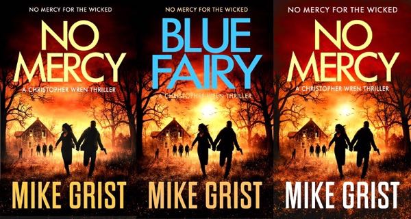
Here are 3 versions with slight variations. Maybe it makes no difference, but I agonized over them at length. I wanted the blue font to work, but it just doesn’t seem to. It looks slapped on and out of place, right?
So I had the left cover. But something about it seemed off too. No sun in the background, though I’m not sure if that was good or bad. At thumbnail size it looked kind of muddy and burnt out. The eye is sort of forced by a frame of black shadows into a glob of samey color in the middle.
I tinkered and tinkered, adjusting contrast, colors, enlarging or shrinking, until I hit on the far right. What’s the difference?
I took out some of the darkness. The top and bottom of the cover looked artificially darkened. It’s a common vignetting effect to focus the eye to the middle, but it kills leading lines and flow. Look at the book 1 cover and see that jagged white splash on the road leading the eye in. Fantastic.
So I lightened up the skies, and colorized them to make them a bit redder. Same for the underfoot grass. Top and bottom are now lighter and redder, allowing the eye to flow up or down. The trees either side are black and tunnel the vision. I think in this cover the running figures and the 3 figures in back pop more, because they’re the only things in full black.
This may be a valuable design lesson. You need very dark and very light, but you shouldn’t overuse either. Did I fix it? Did I make no difference? I imagine not a huge difference – less so because this is book 2, but I’m very happy with it (right now at least) and that counts for a lot.
Onward to book 3.
This week’s plans
I really need to get back in the writing saddle – same goal of 10,000 words by this time next week seems pretty reasonable. Hopefully cover 3 remade too.
