Ginza is the bustling beating heart of high class fashion and commerce in Japan, a labyrinthine grid of broad and narrow streets bristling with corporate headquarters, flagship stores, and chic designer boutiques, sprawled over several square kilometers just a few stops from Tokyo station. Amongst its ultra-elite avenues and alleyways are some incredibly bold front-facade designs, ranging from tie-stores built out of solid glass bricks to port-hole crazy office towers.
This is the first in a 2-part series- the second is ‘10 Office-Front Facades‘, coming soon.
Ginza began its life as the silver section of old Edo (Tokyo) in the early 17th century- the word Ginza itself means ‘Silver Mint’. In 1612 the Edo Silver Coin Mint was built in the district, drawing in all kinds of ancillary traders- fine metalsmiths, jewellers, and bone craftsmen. Ever since Ginza (or ‘The Ginza’) has been a centre of fine crafts, art, and culture.
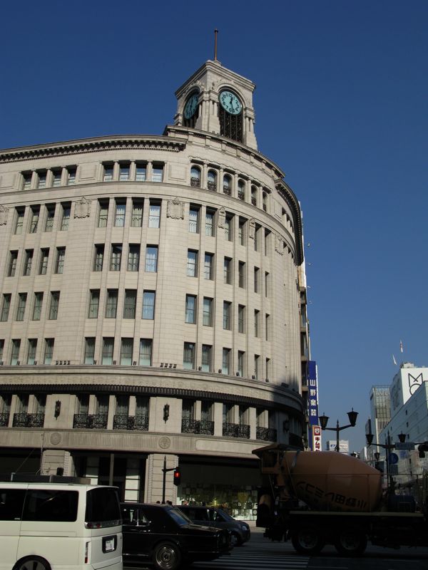
In 1872 a fire raced through the narrow wooden concourses of the district, destroying everything- and a Western architect was brought in to re-build the area in stone with grand classical designs. That architect, an Irishman named Thomas Walters, laid out the street plan we still walk today, and built a large number of Georgian style buildings- as well as the original Wako Clock Tower building, then the Hattori Clock Tower:
WAKO Clock Tower
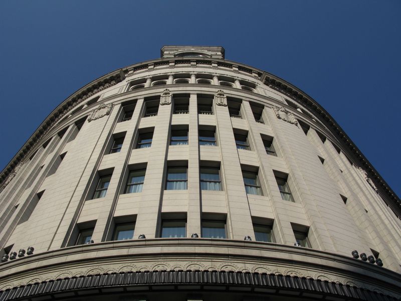
The WAKO building you see here, which dominates the intersection of Ginza and Harumi Streets, is not the original built by Walters for the watchmaker Kintaro Hattori in 1881, but rather a reconstruction built in a Neoclassical style in 1932 by the architect Jin Watanabe. It is one of the most exclusive stores in Ginza, selling the most expensive designer goods and crafts, and one of the few buildings in Tokyo to have survived the rampant bombing of World War II more or less intact. In the aftermath of the war it was annexed by the US Army as a PX, or Postal Exchange- basically a mall for US diplomats and soldiers to go shopping in.
The Clock Tower plays the Westminster Chimes!
On going to Ginza I knew none of the above- it’s all from research I’ve done since. On going I was struck by how similar this part of Ginza is to Oxford Street in London, in particular the intersection of Oxford and Regent Street. I had a very old-world feeling which was very nice. Also a bit of a flustered feeling, which I’d felt when doing Christmas shopping on Oxford Street- so many shops, so many people, so many choices!
The Kanji for WAKO- 和光 means ‘peace light’
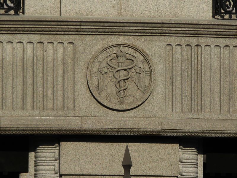
Enjoy this close-up of a decorative detail:
It looks to me like the symbol of the Hippocratic Oath on a clock-face. The clock-face makes sense as the original owner Hattori was a watch-maker. The Oath, hmm, any ideas?
.
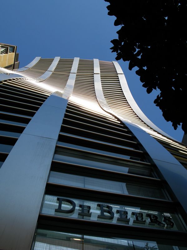
De Beers
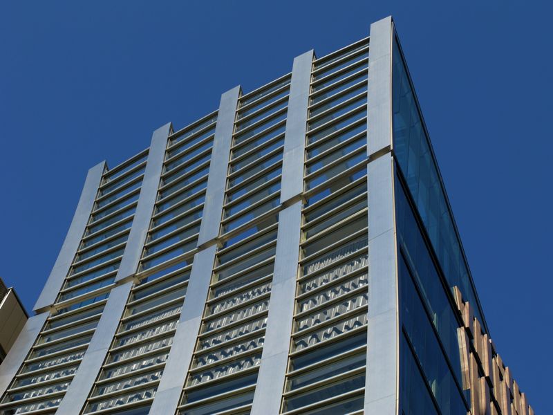
The De Beers facade is one of my favorites- it does what it does with such smooth grace and elan, transforming the building and our conception of it into something fluid, smooth, and incredibly classy.
De Beers of course is the diamond company, started in South Africa by the entrepreneur Cecil Rhodes. That was the form globalization used to take- colonies filled with indentured servants and slaves managed by ‘corporate’ magisters and overlords. Rhodes was a high-class bigot, racist, and British-supremacist himself, as can partly be expected from the times. He named a whole country after himself- Rhodesia, now split into Zambia and Zimbabwe. Rhodes is also famous for the prestigious Rhodes scholarship. Perhaps he was actually gay though? Of course that was heavily frowned upon in the times, and could have easily gotten him unseated had it been allowed to come to light.
All that dificult legacy aside, De Beers certainly know what style is. Luxuriate in this fuller size shot:
And another of the roof zone, just empty air- but probably a great place for a sun lounge:
.
Hermes
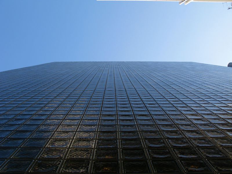
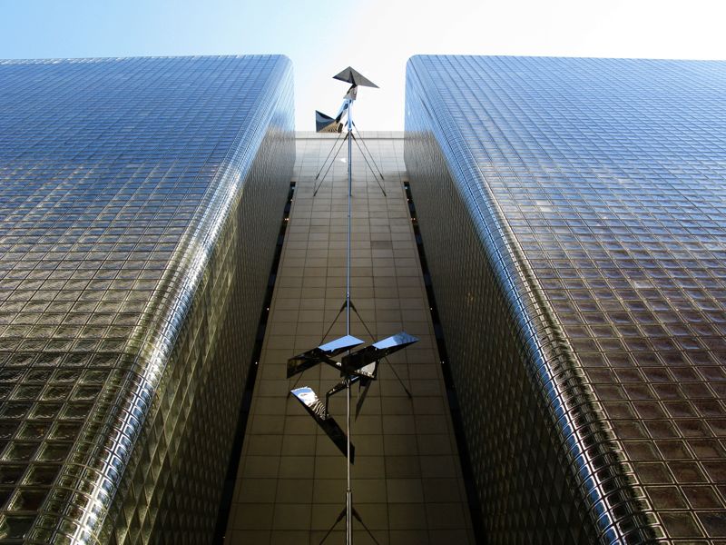
The Hermes building is quite awesome to behold, leaving a lasting impression of just massiveness compounded by the tight little street it broadsides. There is no way to take a photo of it that gives a clear feel of how the thing just looms over you. It is some 20 stories of sheer glass-brick facade, with no give and no translucent windows, unapologetically sucking up your attention as you go by. When I first stumbled upon it I thought perhaps it was a palace.
No, it is Hermes! God of War!
Wait, no. A store that sells fashion stuff. Neckties, I suppose. Here’s the central detail, looking up between the two glass-brick wings. This is some kind of rotating-with-the-wind steel sculpture.
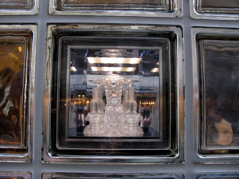
Here is a semi-translucent brick on the ground floor, displaying some of the hyper-expensive crystal goods that can be bought inside:
.
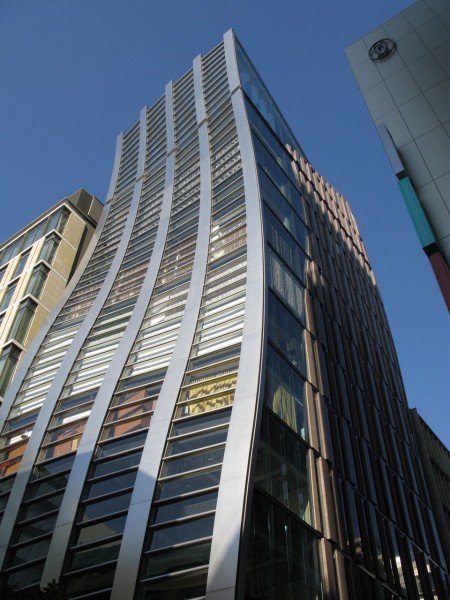
H & M
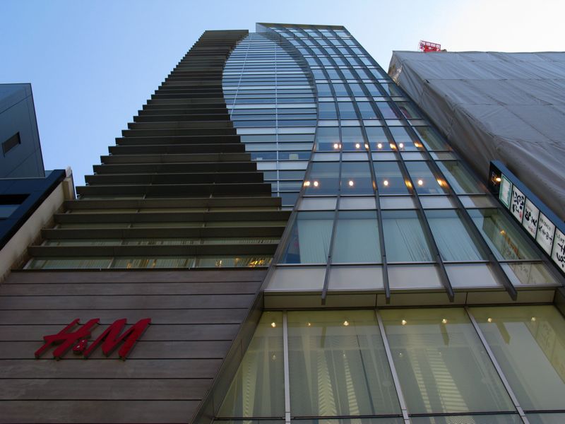
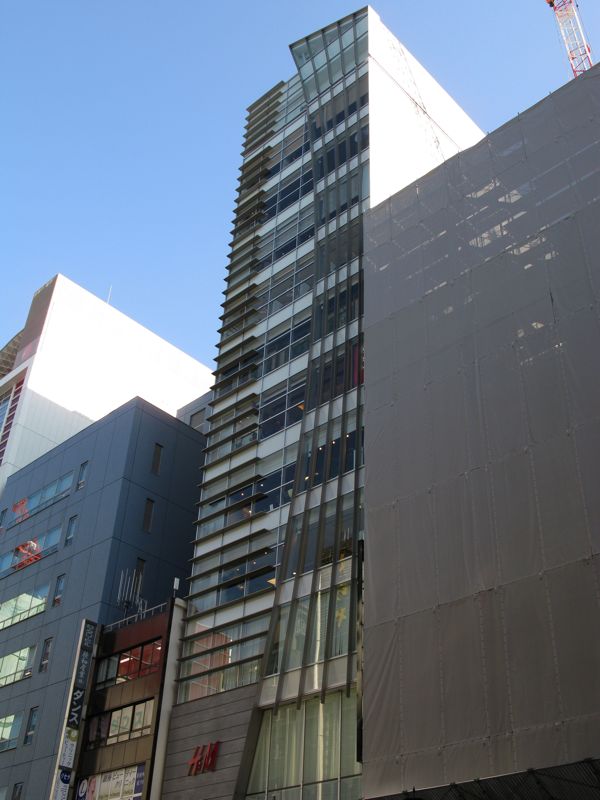
H & M just has a nice swervy shape. Of course it’s neither as ambitious, impressive, or as technically accomplished as the De Beers building, but it’s going for the same thing with that smooth arcing wave up the front.
Inside they sell clothes. I heard when this store first opened earlier this year people were queueing around the block to get in. But that’s not saying so much- people here queue for just about anything new.
.
Mikimoto 2
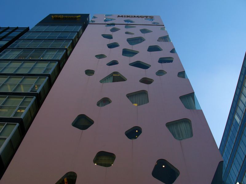
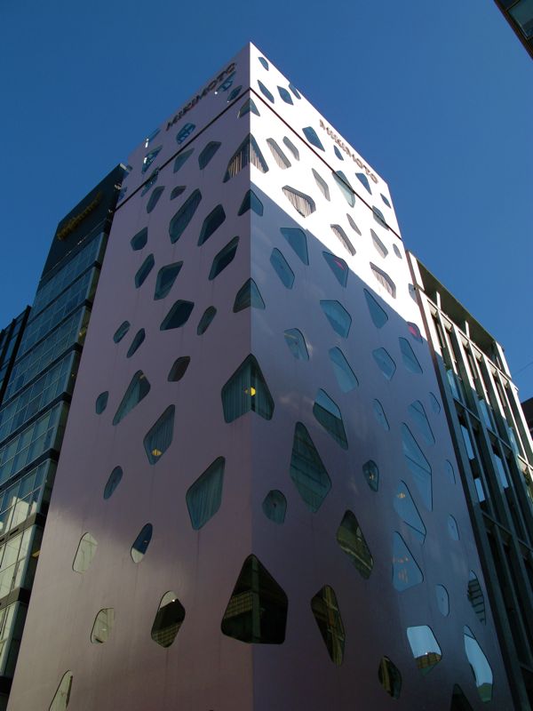
Mikimoto makes jewellry, and houses it in outlandish pink blocks of cheese. Somewhere in Ginza there is another pink block of cheese called Mikimoto 1.
Situated almost next door to the De Beers building, the two tend to somewhat take the wind out of each other’s sails. When it comes down to it though- Mikimoto to me seems kind of cheap, if cutesy. De Beers is ultra-elan and space age. That should accurately sum up the products each place sells.
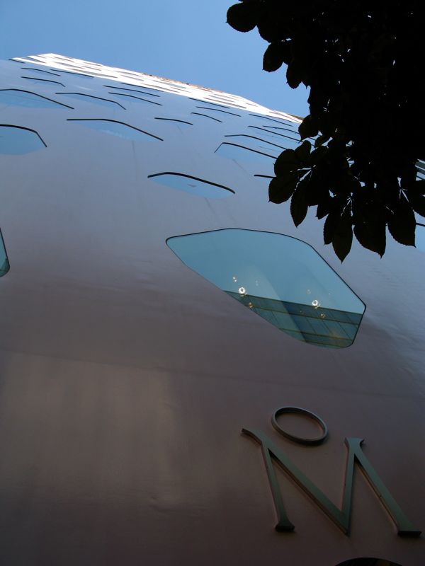
Here’s a few Mikimoto 2 details:
Art shot up the front, with tree.
.
I like this pink.
.
Audemars Piguet
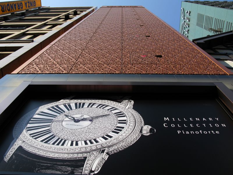
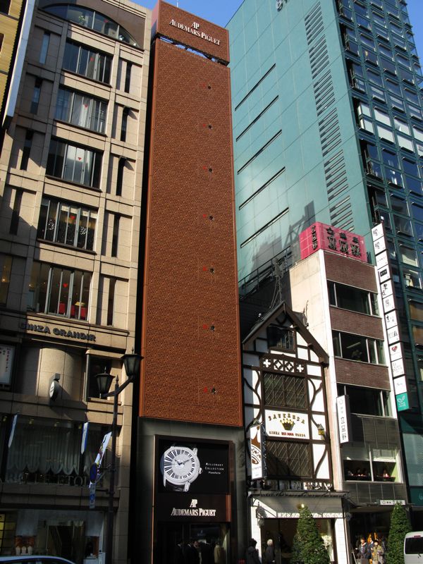
I don’t have so much to say about this- I just like the copper filigree design, it makes me think of a watch’s internal coggery, which I assume it is supposed to. Here’s a bigger shot:
.
Shiseido
Shiseido is, amazingly, the oldest cosmetics company in the world. From Wikipedia:
‘Arinobu Fukuhara, former head pharmacist to the Japanese Imperial Navy, established the Shiseido Pharmacy in 1872. After a visit to the United States and Europe, Arinobu added a soda fountain to the store. This later grew into the Shiseido Parlour restaurant business, and eventually led to the introduction of ice cream in Japan.
Shiseido was the first cosmetic line to introduce flesh tone and color correcting face powders. Until that time, all Japanese face powders were white. Shiseido also developed the softening lotion, a lightweight liquid of toner-like consistency. The oldest softening lotion is named Eudermine, which is still marketed and sold at all Shiseido counters. The softening lotion was developed in response to lead poisoning, as the Japanese women used makeup based on white lead. In 1923, the company began expanding its store-base; it now has approximately 25,000 outlets. In 1927, a joint stock company was formed.’
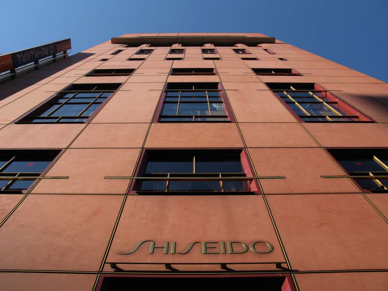
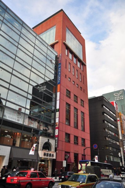
Impressive stuff. The building is a great shade of lip-stick red, that’s the reason it’s on this list. A very striking color.
.
Silkland Gallery
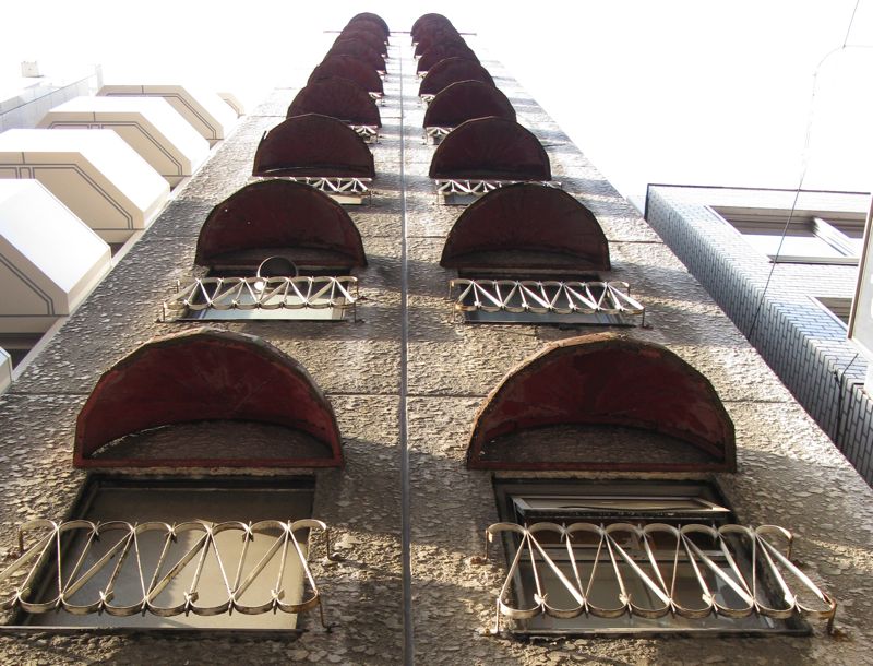
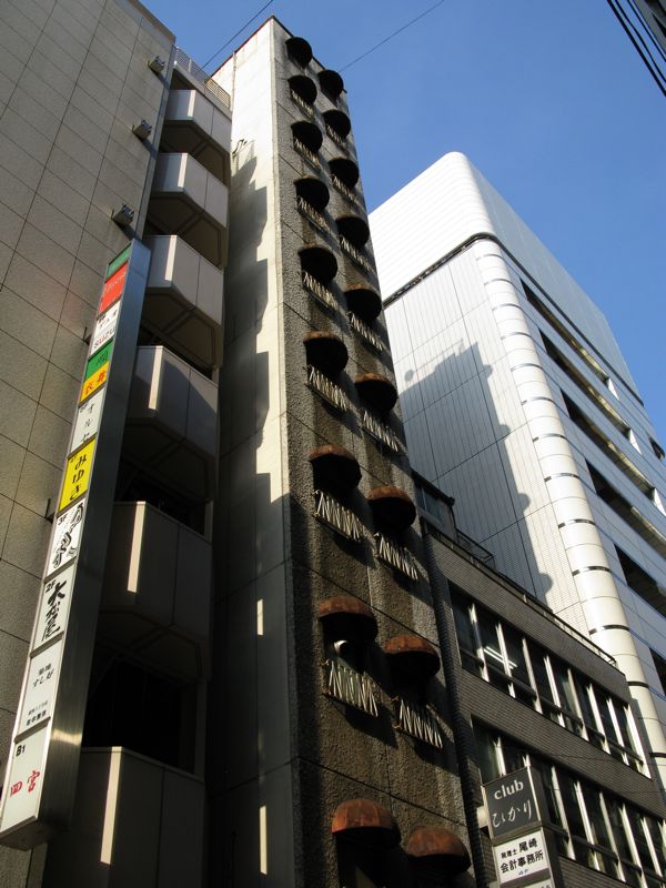
I like this building for its window umbrellas, a dark and regular red against he building’s rusty brown plaster. It’s a gallery for high class art- here’s the company’s mission statement from their website:
‘Silkland aims to create a fulfilled society by means of art and culture. The name, composed of the words “silk” and “land”, stands for the gallery’s vision of “pursuing high quality, genuine work.” The gallery handles highly recognized artists from all over the world. Believing that paintings enrich people’s minds and hearts and leads audiences to a peaceful world, they provide works that convey a sense of joy that will deeply move viewers’ hearts.’
I can’t argue with that.
.
Swatch
The Swatch building stands close to H & M, and intrigues me because I wonder if it is supposed to look like a watch strap. If not that, then it’s just a funky design of some type. Also I like the very open lobby below, filled with plants and some strange red triangle. I don’t know what’s going on here- but I like it.

.
Tiffany & Co.
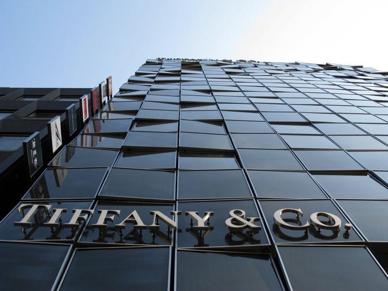
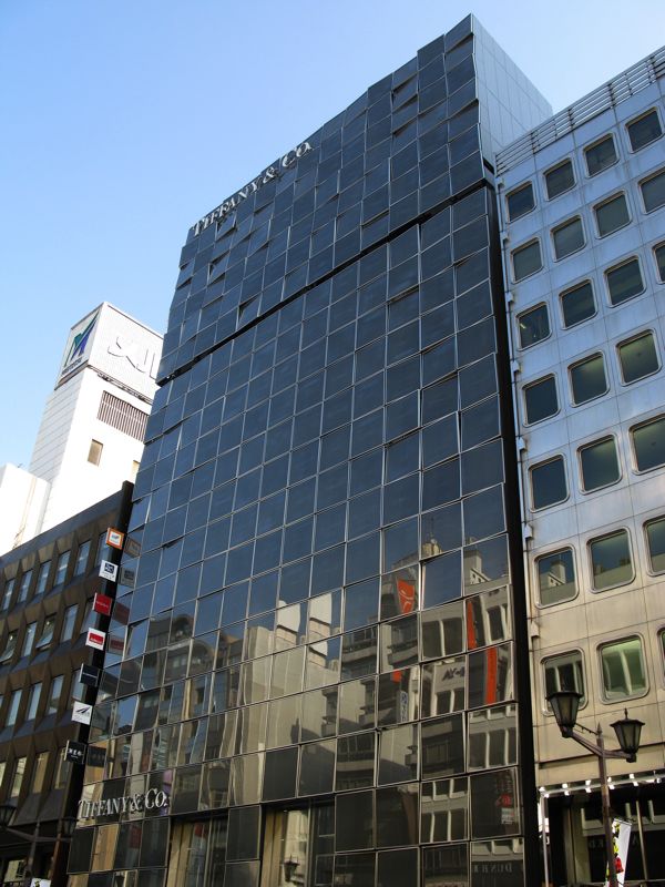
I had no intention of including big name designer companies on this list of facades just because they’re big names- and so almost missed the nuance of this Tiffany store (there are 2 in Ginza) as I strolled by saying- ‘No Thanks!’ to the Man. Turns out I was right to give it a second glance though. What I at first thought were just a lot of windows left half-opened rather untidily turned out, on closer inspection, to be an intentional design trick. The windows are irregularly cantilvered in, out, or diagonally- to present us with a multi-faceted store-front in semi-black glass.
I like it, it’s simple and confusingly eye-catching.
.
Some of the facades that didn’t make it onto the list?
Apple
Everyone knows Apple. |
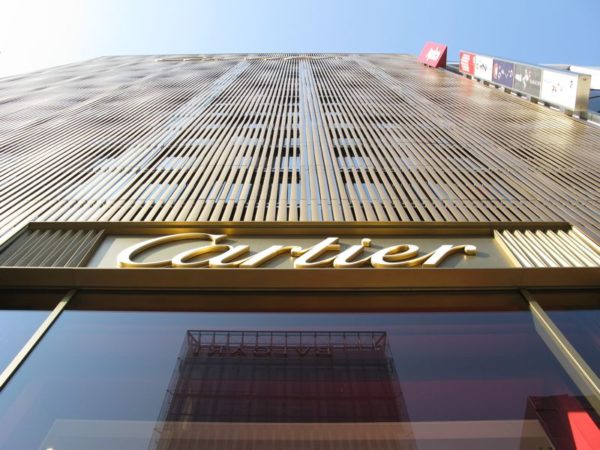
Cartier
Bland gold affair- try again, Cartier! |
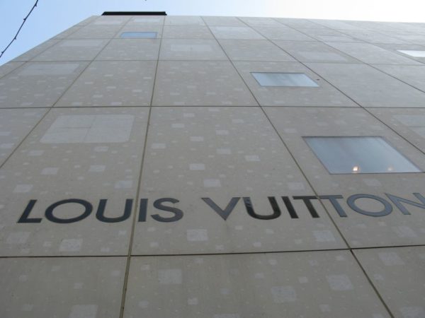
Louis Vuitton
Dull sandstone thing. |
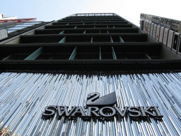
Swarovski
The ‘jewel-box’ first floor facade is excellent, sadly though the building is let down by being very normal above that. |
And of course many more, even less remarkable.
FACTFILE
Location – Ginza!
Entry – None, not interested in the interiors this time.
Facts – Many.
Architect – Many.
Highlights – My favorite- De Beers. Second favorite- Hermes.
TOKYO
You can see all MJG’s Tokyo content here:
[album id=5 template=compact]








Comments 6
Some creative shots…good to see you putting the D90 to good use…I like the one of the crystals through the glass square.
The medical symbol is called a caduceus and has multiple meanings. My guess is that, since the symbol was adopted by the U.S. Army medical corps (and this is how it became a symbol of the medical profession) and the building was used as a U.S. army PX, the symbol may have been used or seen at some point and just stayed with the design. None of the meanings of the caduceus fit a watchmaker (at least not any that I could find).
Great pictures!
The Hermes building is impressive. I like the Sikland Gallery building. Cool how even small pieces of land are utilezed for a tall building.
Author
Jason- Thanks, the crystals one is a neat way to display merchandise yeah.
Orchid64- The Caduceus, right, I knew that but had forgotten, thanks for reminding me. I wonder if it wasn’t just an affectation of the architect- to make the building seem elaborate- since it was built with only a watchmaker in mind, before the US got involved.
Tornadoes- That’s true, efficiency is key when real estate values sky-rocket- you have to get a lot of bang for your buck.
My favorite is the one you had the least to say about–Audemars Piguet. I tend to go for things a bit more traditional and the scrollwork in the stone looks so vintage. Having said that, they are all beautiful works of art with Hermes a close second.
Great photos
Hermes God of War? Uh … that would be Mars. Hermes is the messenger of the gods.
Hermes though explains why the ‘medical’ symbol on the building:
“The building’s outer wall has an interesting relief that most people overlook. It features the letter H for Hattori, with a cane and snake that symbolize Hermes, the god of commerce; scales to symbolize precision machines; and a silver cup to represent precious metals.” [plundered from http://www.oldphotosjapan.com/en/photos/158/hattori-building-ginza%5D